Would Heu-risk it? Part 19: Constantly Consistent
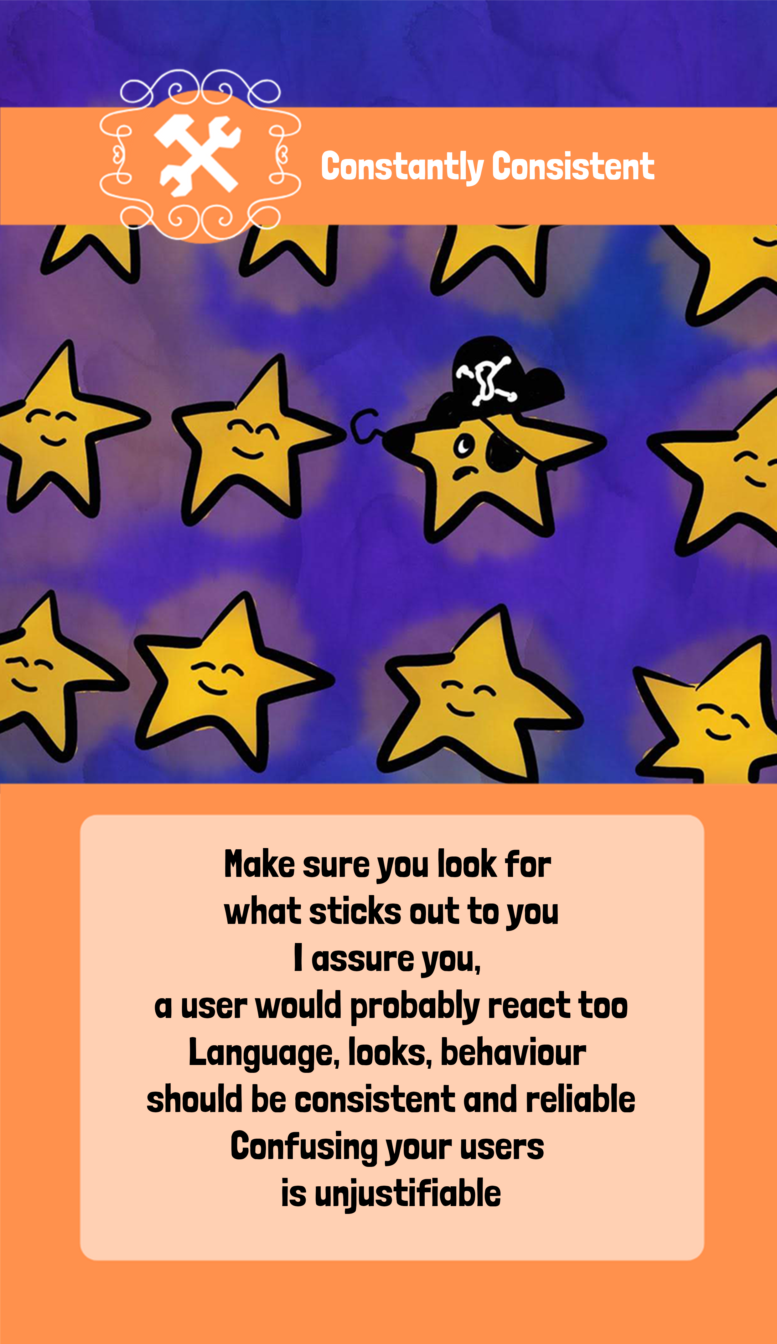
Oh, this is a tool I really advocate for. This is so important and so hard to get attention on. (Also: How cute is that pirate star?!)
Quickly, let us check the rhyme:
”Make sure you look for what sticks out to you
I assure you, a user would probably react too
Language, looks, behaviour should be consistent and reliable
Confusing your users is unjustifiable”
So, what does it mean?
Imagine using a system where pages look different, the same actions (buttons, menus etc) have different names in different parts of the system, tab order is completely messed up. Some parts use a very formal, almost legal, language while others use emojis and very informal language.
If you are anything like most users, this is not a system that you would feel comfortable using. You might even feel that it seems hard to trust it.
Even if you can do everything you want to. Even if it’s secure and has fast response times.
Because it is not consistent. It will feel… off. Even if it follows every requirement ever written about it, I’d never feel this was a good quality system.
Because we like consistency. We like when things feel coherent.
Imagine someone saying ”yes, I’d love to!” with a body language screaming no. It will feel false, right? It will feel out of place and you will probably listen to the body language more than the words.
The same goes for applications. If we claim to have the ”most secure and professional stock market application ever built” but the system looks more like a kids’ game, we might not trust it. Likewise, if we are selling ”Da FunnEST MeMe GenERatOR” but it looks like a bank system from the 80s – that might also feel less coherent.
The UX discipline knows this very well, and one of my favourite things to quote is Jakob’s law:
”Users spend most of their time on other sites. This means that users prefer your site to work the same way as all the other sites they already know.”
Jakob’s law, Jakob Nielsen
My favourite example of this: If every e-commerce site out there uses a shopping cart as an icon for ”this is what you said you wanted to buy”, deciding on using a cash register instead will confuse people, making them less likely to have a good overall experience with your site. People also expect it so show up in one or two different places on the screen, again: Go against it on your own peril!
This of course means that the people planning, designing and building your e-commerce site needs to research other sites.
So, we need to be consistent. Consistent within the product, consistent with similar products, consistent with what we claim, consistent with that users expect, consistent with the image we want to portray.
This goes for layout, color schemes, language, choice of pictures, how we name things, how to progress in the system and so much more!
Humans will find the things that don’t match the pattern. It is one of our superpowers. Something we can exploit intentionally as a way of guiding them where we want them to go. But also, a curse that makes it hard to introduce changes.
Because we also need to be consistent with history. If we called a button SAVE for 4 years and suddenly decide to move them, change the colour and rename them to SUBMIT, we need to be very aware of how it will affect old users. Especially if we decide to only change it on certain parts.
Story time
I have many stories of fights I’ve had with developers (and project managers) about the importance of consistency. I have a very bad reaction to ”It’s not in the requirements” and this in one of the hills I am willing to die on. I don’t care if we have ten different developers doing ten different parts, if a button does the same thing, it should be called the same thing.
If we use tables/lists throughout the system, and the paging and sorting has worked the same way for years – we shouldn’t just change that without telling the users that it has changed, because it can actually be something they use in their work process without us knowing. Such as internal users using the sorting of a list to know which cases to work on first. And then we change that sorting and mess up their work. Not nice.
But my favourite is actually related to when we did, intentionally, change the style of an application I worked with. We had a new colour scheme, new fonts and things were slightly shifted on the screen.
Unfortunately, we never told our customer service division. Their interface with the system had not yet been updated and they can’t access end users’ interface (because of reasons. And things), so they only knew about it through screen shots in their user guide. That was not updated of course, because we didn’t know they had one. Or needed one.
So, queue first customer call.
Customer: I have a problem, I want to do this thing.
Support Person 1: Ok, you need to press the blue button in the middle of the screen.
Customer 1: What blue button? There is no blue button.
Support Person 1: Scroll down a bit, it’s blue and it says ”Press Me”
Customer 1: No… there is no blue button.
… and so on. And the next call. And the next.
We had changed the button to another colour. And moved it a bit.
Oops.
Quote of the day
”We humans like consistency by default! Our physical bodies constantly strive for consistent balance, so we can be healthy. We need to feel that things are consistent to feel secure and safe.”
Anton Nikolov
Reading suggestions
The unspoken requirement – Stickyminds
Few HICCUPPS – Developsense
Jabob’s law – Laws of UX
Jacob’s law of internet UX (video) – Jakob Nielsen
Why consistency is one of the top indicators of good code – Joseph Gefroh
BBST Foundations, oracle heuristics lab – BBST
Using test oracles – Michael Kelly
Design principle – Consistency – Anton Nikolov
Previous posts in the series
| Title and link | Category |
| Part 1: Introduction | None |
| Part 2: Mischievous Misconceptions | Trap |
| Part 3: The Rift | Weapon |
| Part 4: The Fascade | Tool |
| Part 5: The Temptress’ Trails | Trap |
| Part 6: Allies | Weapon |
| Part 7: Don’t turn back | Tool |
| Part 8: The Glutton | Trap |
| Part 9: Beyond the border | Weapon |
| Part 10: Forever and never | Tool |
| Part 11: The Shallows | Trap |
| Part 12: The Twins | Weapon |
| Part 13: The Observer | Tool |
| Part 14: Alethephobia | Trap |
| Part 15: Opus interruptus | Weapon |
| Part 16: The Illusionist | Tool |
| Part 17: Fools’ assumptions | Trap |
| Part 18: The Unexpected | Weapon |